Overview
Re-design work of an existing video games e-commerce website for a university project. The new design featured a slick and modern black color palette that complements the theme of gaming. The visuals and images were also re-done to enhance professionalism and better the user experience.
Timeline
August 2023 - November 2023
Type
University Partner Project
Role
UI Designer, Front End Developer
Tools
Figma
|
Adobe Illustrator
|
HTML
|
CSS
|
JavaScript
Context
This project was part of a course named “User Interface Design”, where each class was assigned a business domain and would need to find relevant small to medium sized local businesses with a working e-commerce website to analyze and re-design. The business domain we’ve received was “Video Games and Consoles”. The assignment is broken down into three parts: UI analysis, UI design, and UI implementation.
Part 1: UI Analysis
Assignment 1’s task is to pick out 4 websites in total, with 2 good and 2 bad, and providing a constructed detailed critical analysis. For each website, we would need to visually point out the positive and negative features of the websites. For example, a positive feature might be good use of Fitt’s Law to maximize click accuracy, and negative being items being poorly aligned vertically. For each website, we would have to analyze the home page, product list, product page, and shopping cart. The final submission is presented through a visually well-designed report.
Part 2: UI Design
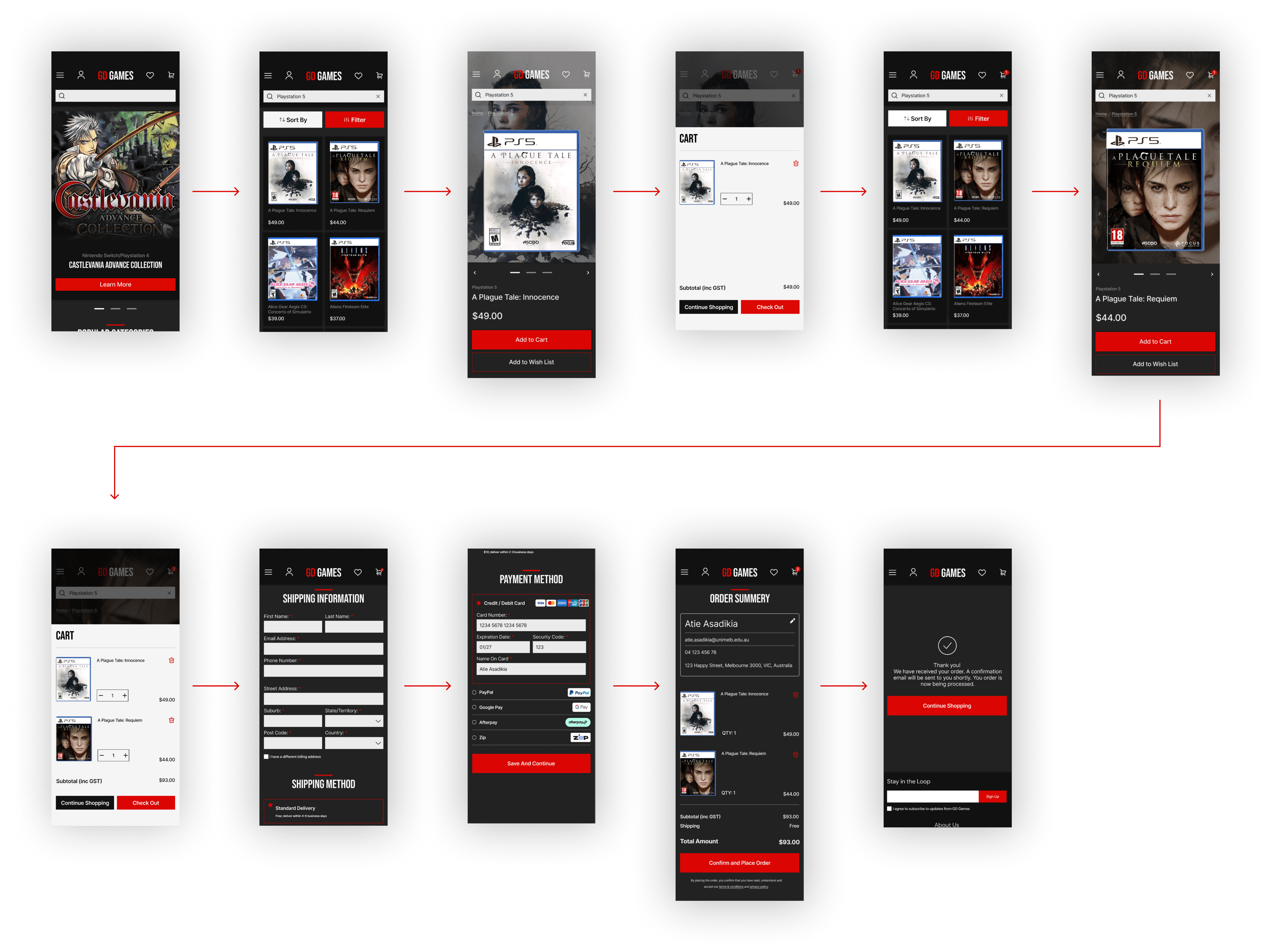
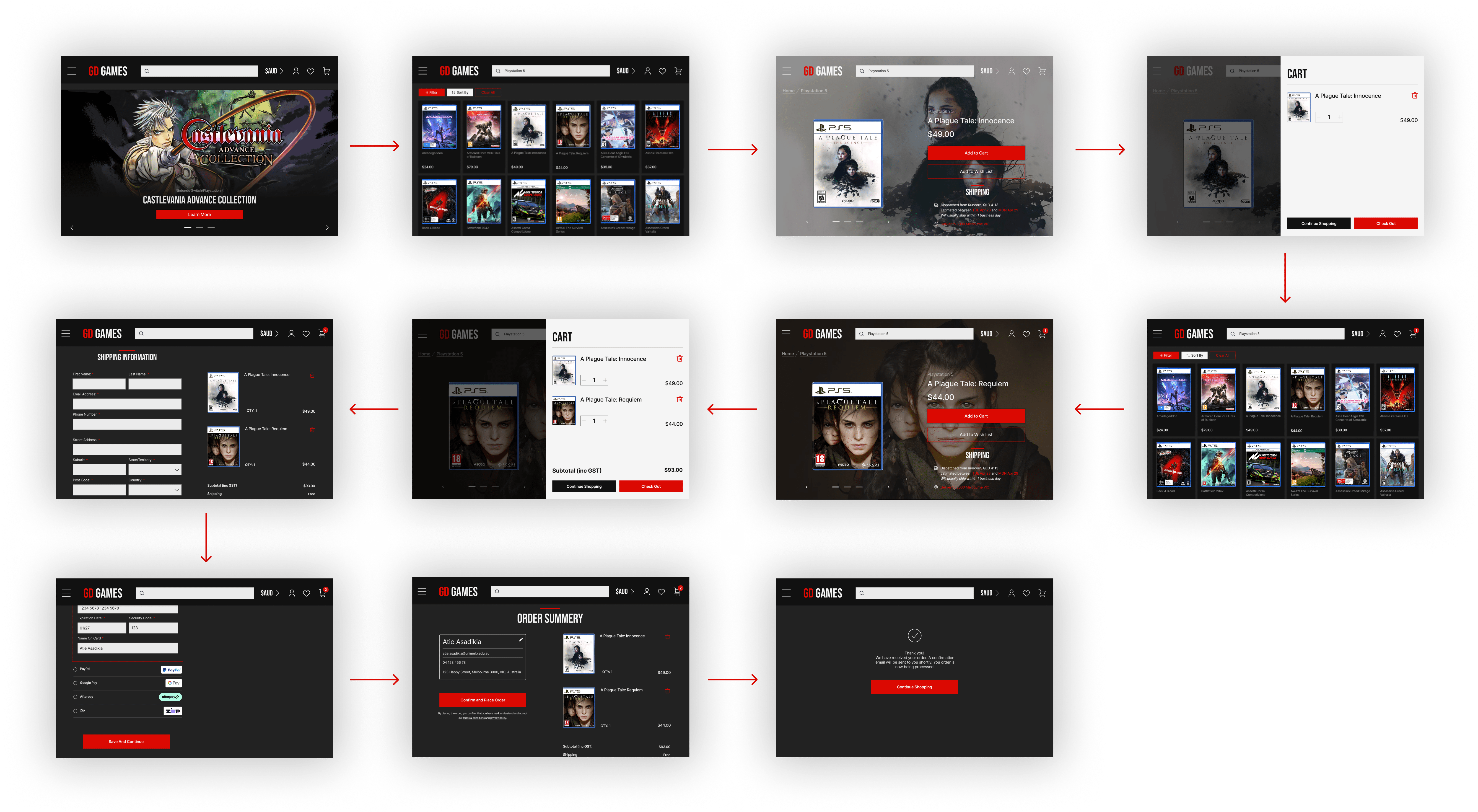
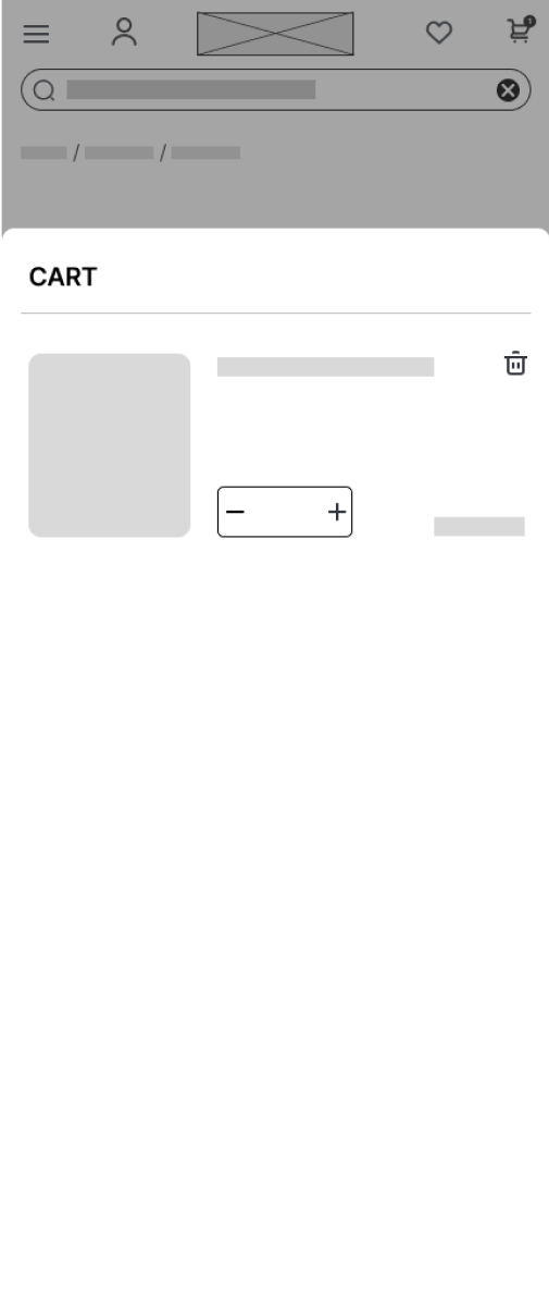
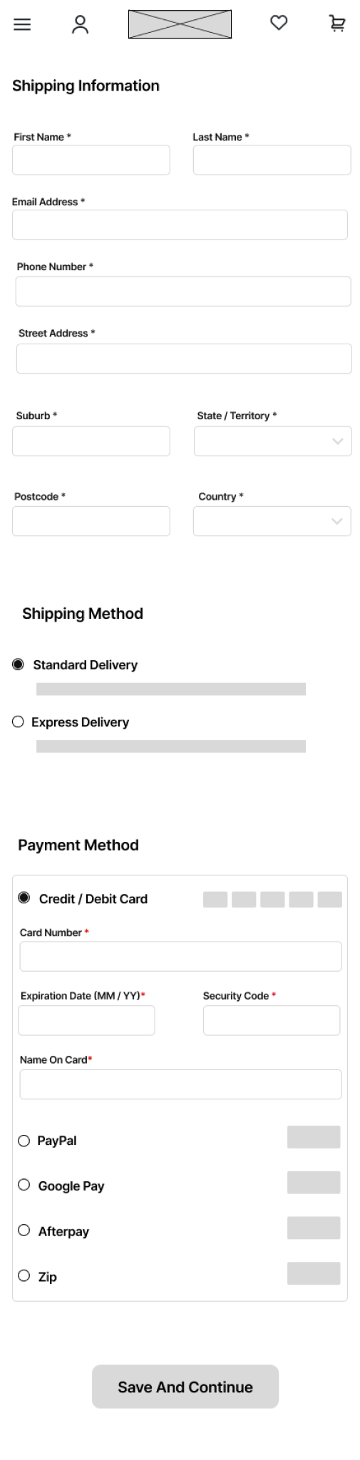
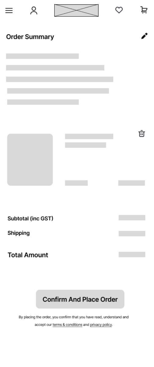
Assignment 2 began the design process of the website. In either Figma or Adobe XD, each group would have to produce a functional high-fidelity prototype for both mobile and desktop. The prototype would need to include the entire user flow process, from home screen to adding two products into the cart then to checking out. The final report consists of sketches, wireframes, mood/inspiration board, and critical analysis of high-fidelity prototype.
Part 3: UI Implementation
Assignment 3 requires students to implement the front-end component of the design from assignment 2 into vanilla HTML, CSS, and JavaScript. Using these programming languages to demonstrate the same user flow. The website should be responsive, adapting to at least two screen-sizes: mobile and desktop.
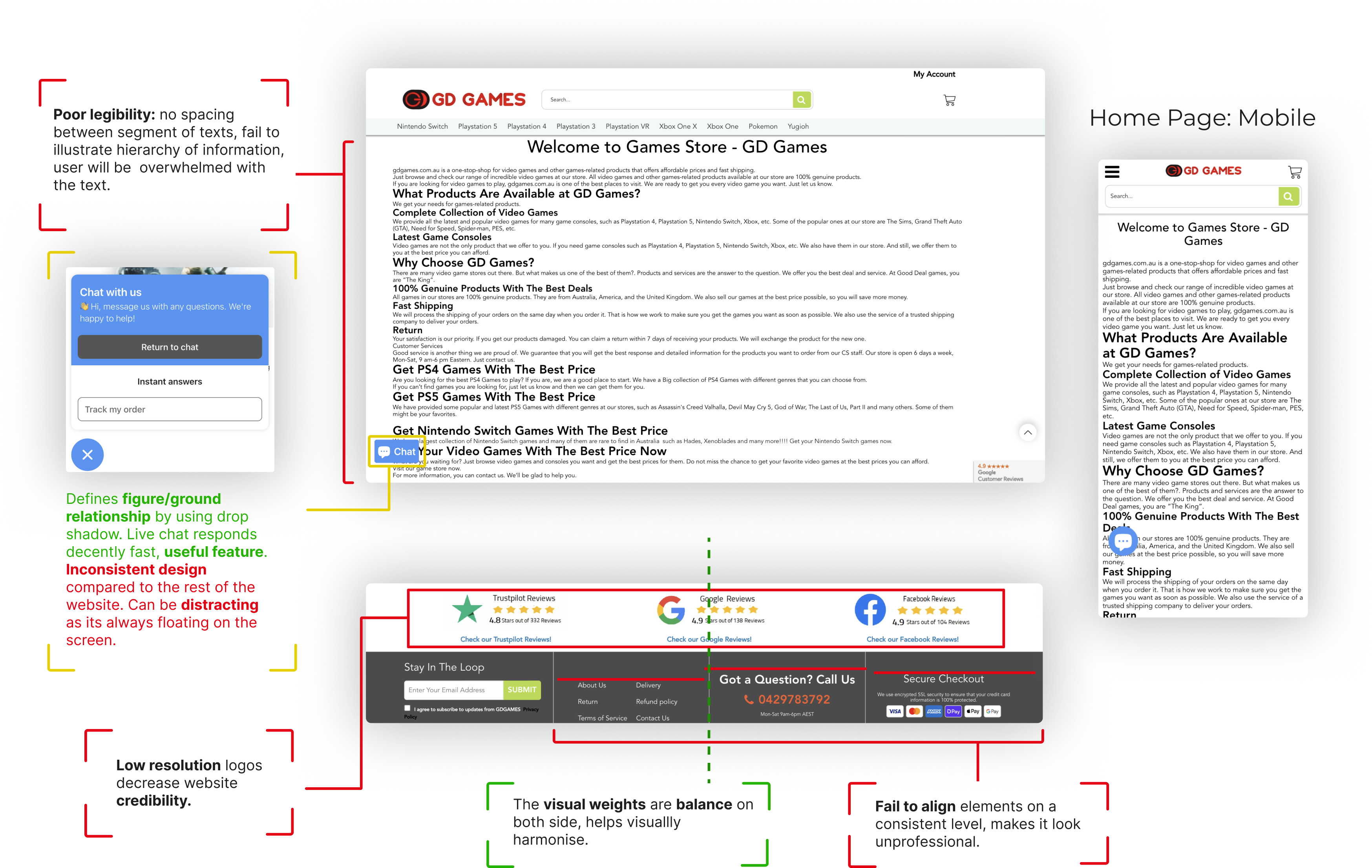
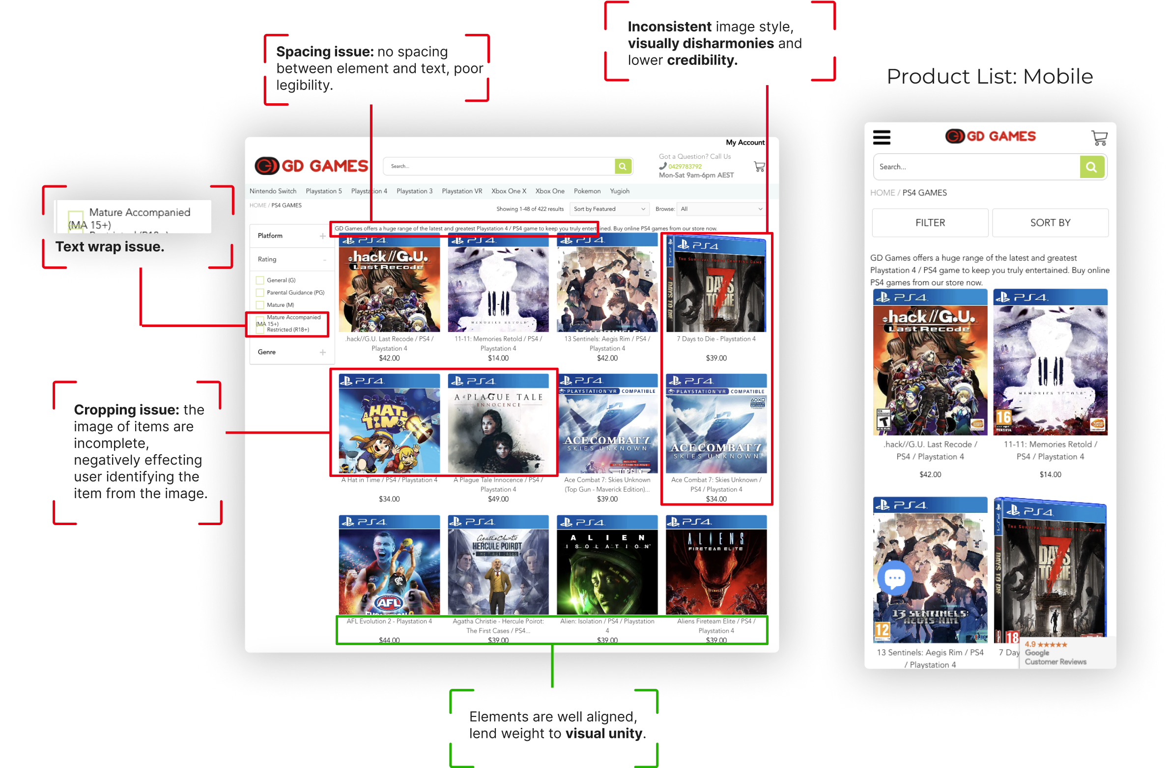
Original Site Analysis
Home Page
Product List
Shopping Cart
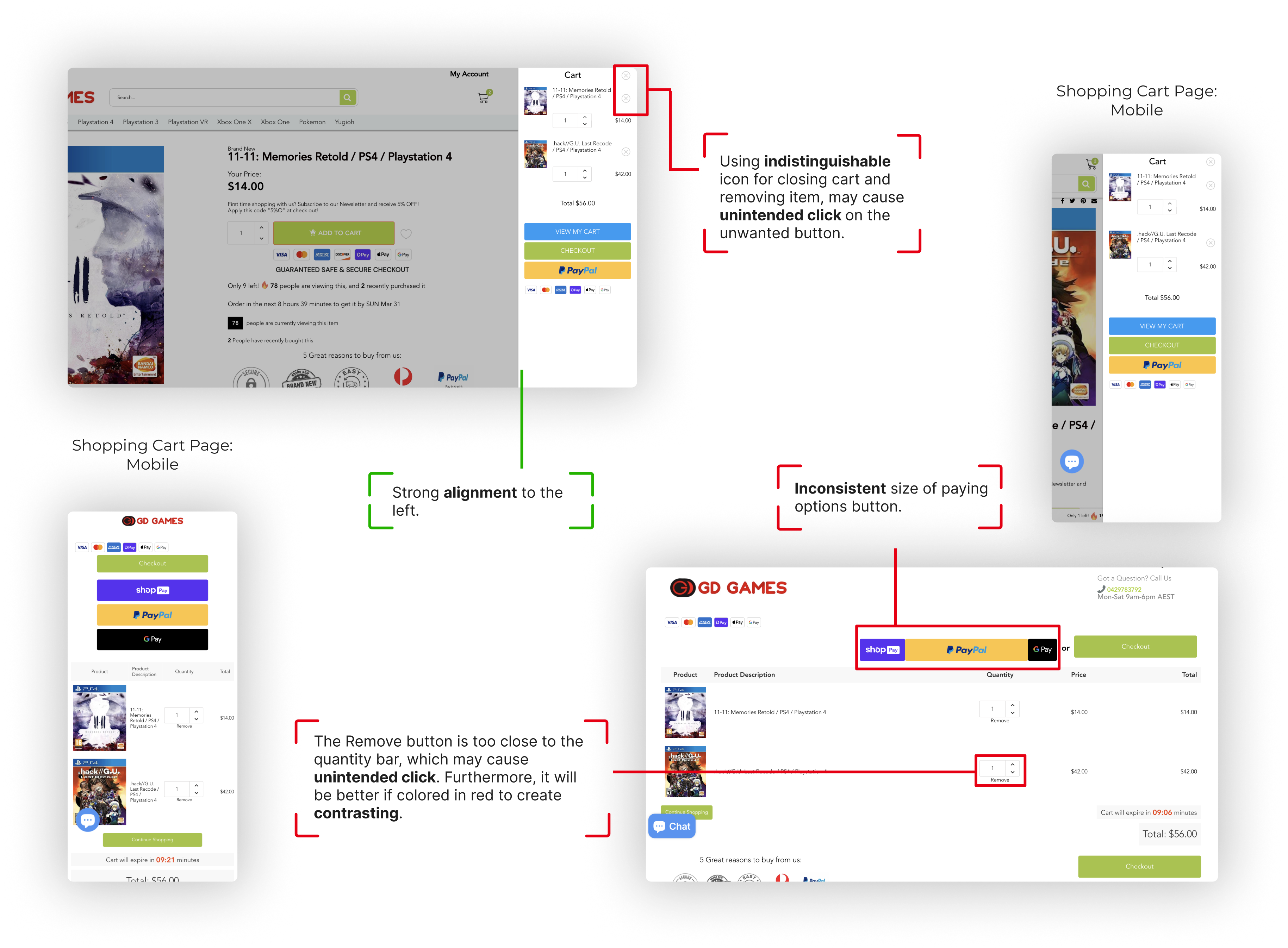
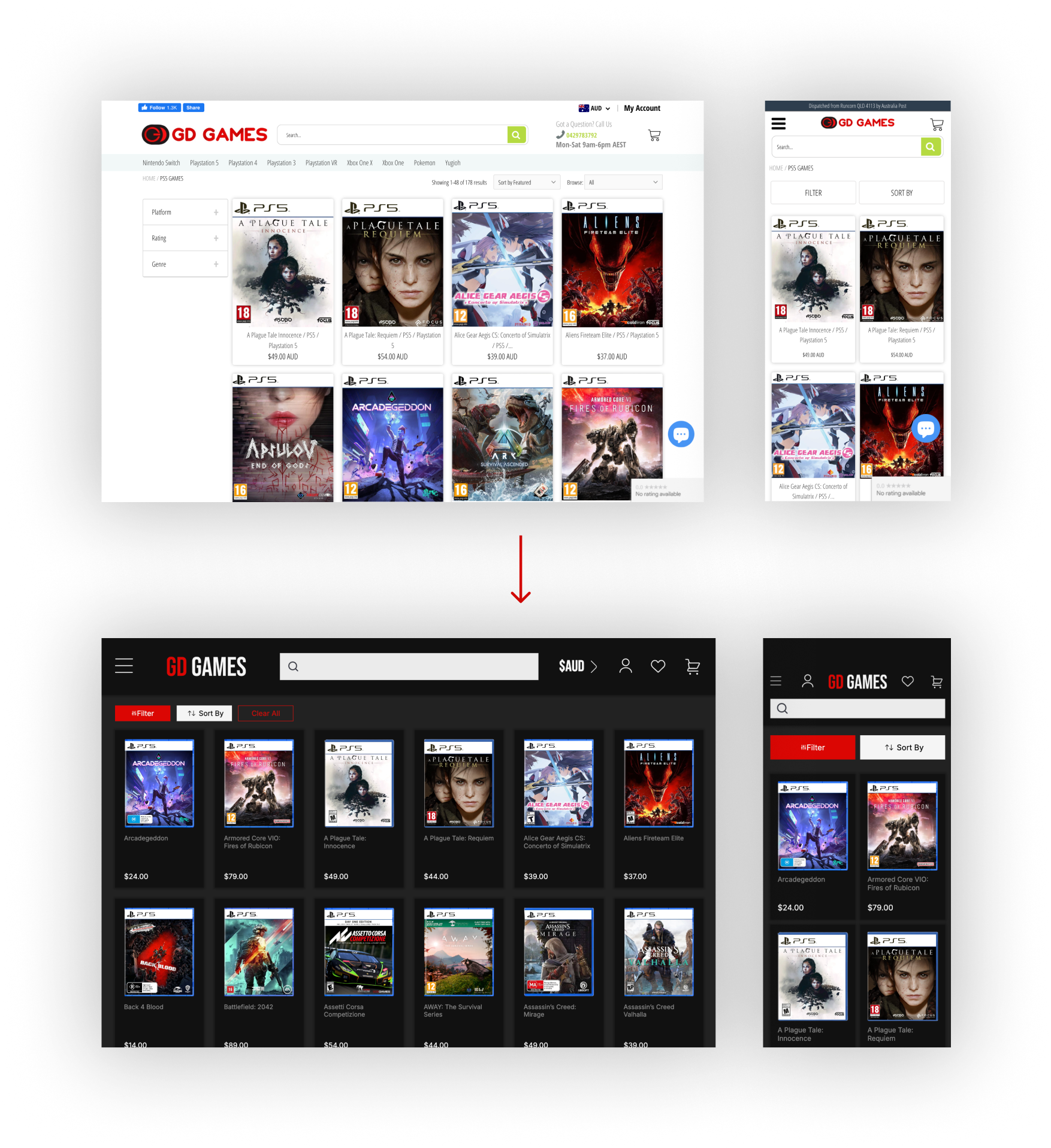
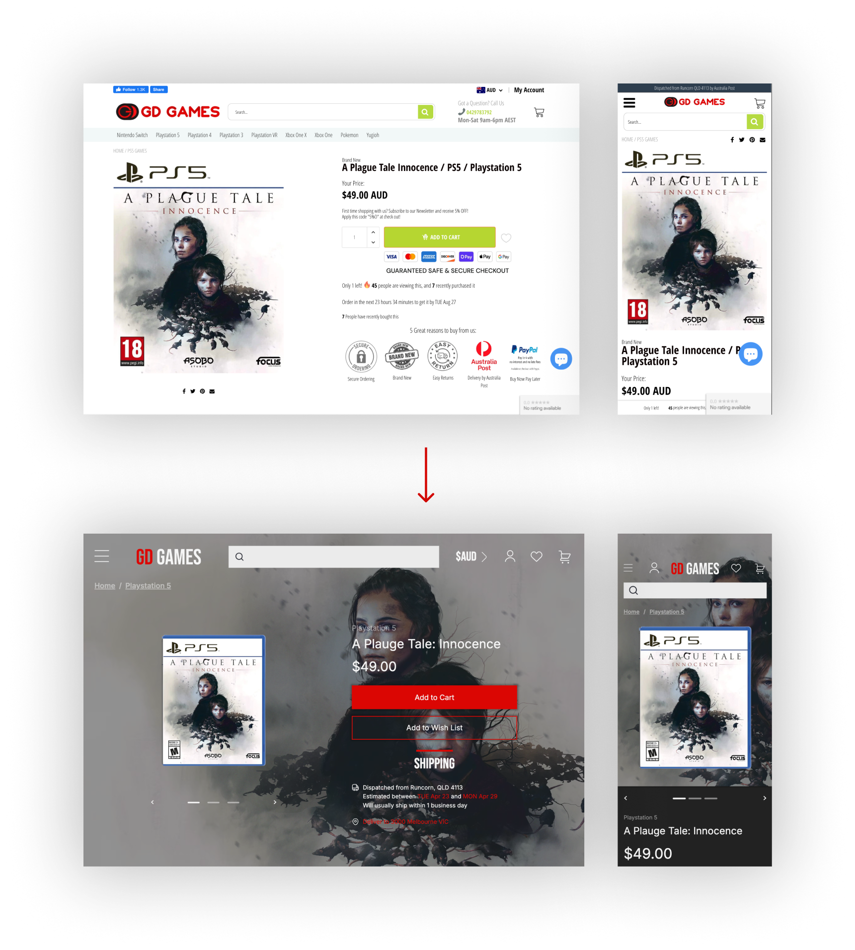
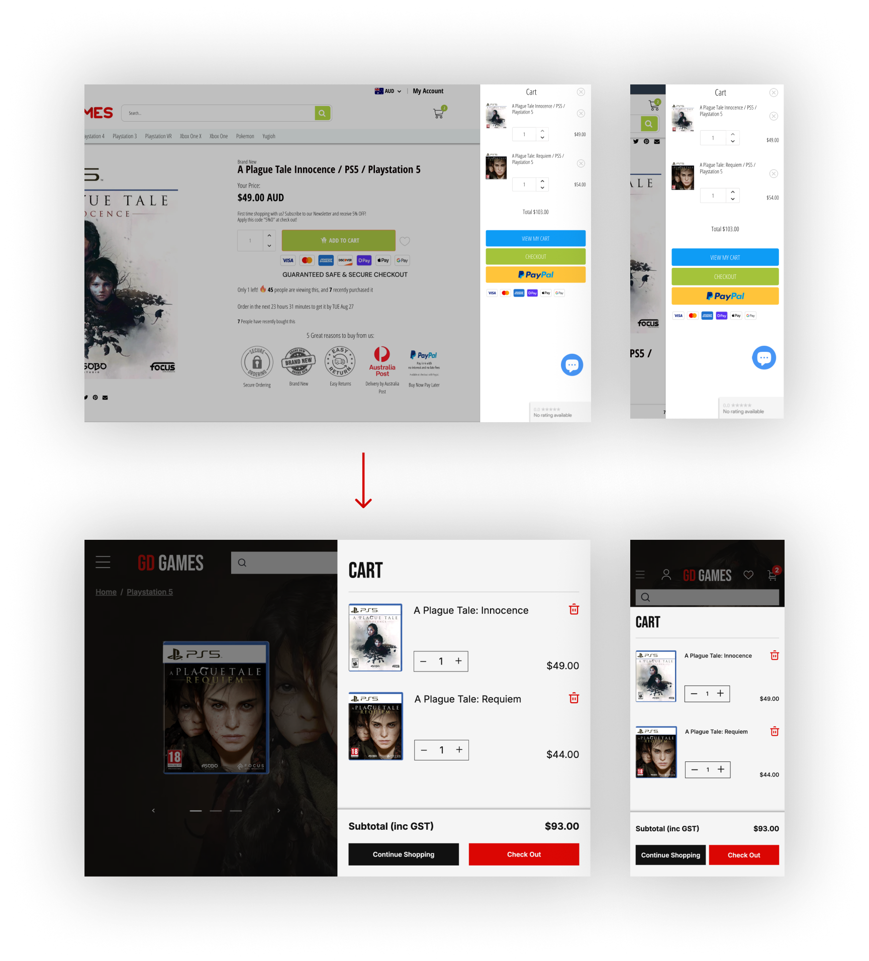
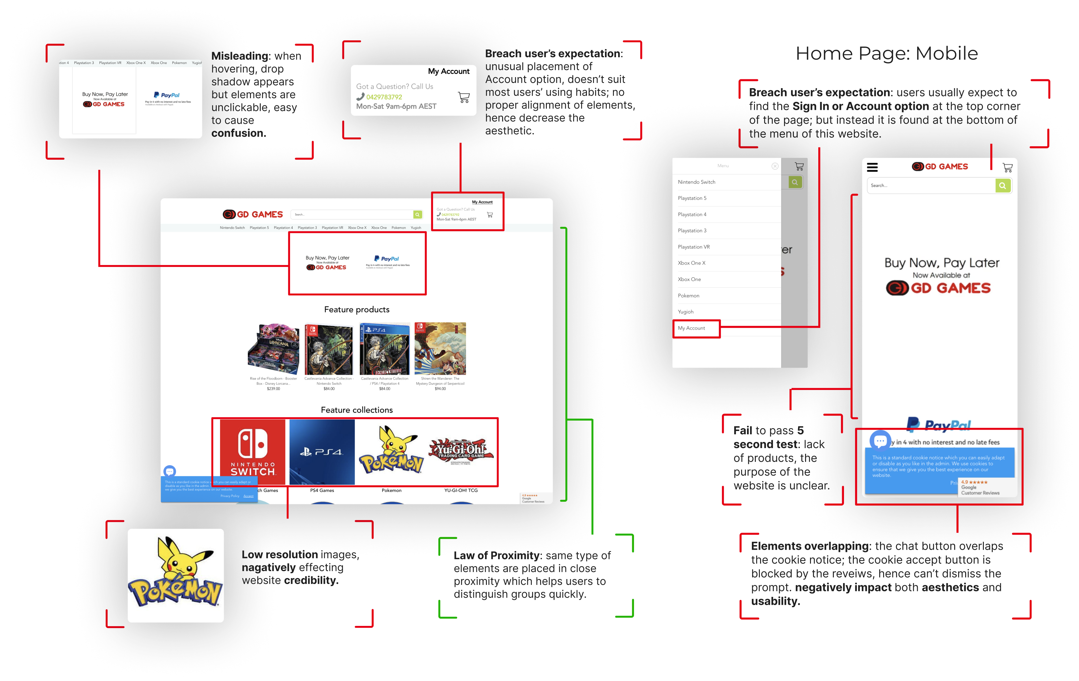
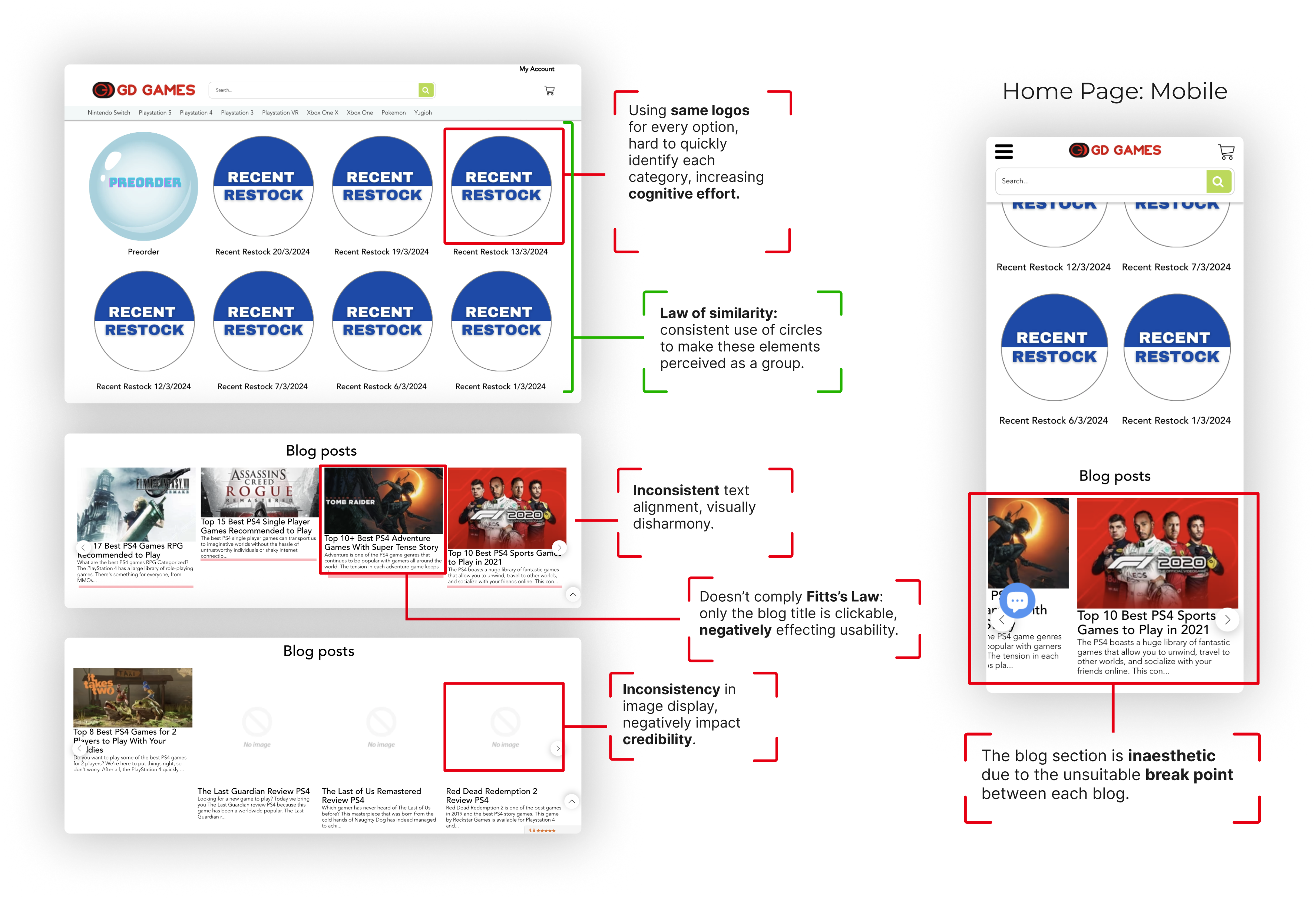
GD Games provides various range of gaming products and good customer service. However, there are a number of noticeable interface deign problems within the website. For instance, some elements are placed without prudent design decision-making. And there are insufficient spacing at some places which lead to low legibility and fail to present hierarchy, and worsen the aesthetic of the website. In addition, cropping issues with images and text wrap issues impact the credibility of GD Games.
Positive Highlights
Consistent font type and size
Consistent color palette throughout website
Elements are grouped clearly
Product list is nicely aligned with images, name and prices
Wide range of products available
Critical Problems
Lack of spacing between elements or texts to establish hierarchy and ensure legibility
Unusual placement of some elements, which don’t follow user’s expectation
Cropping issues and text wrap issues
Elements overlapping on some pages
Insufficient alignment on some pages
Design Objectives
Resolving Issues
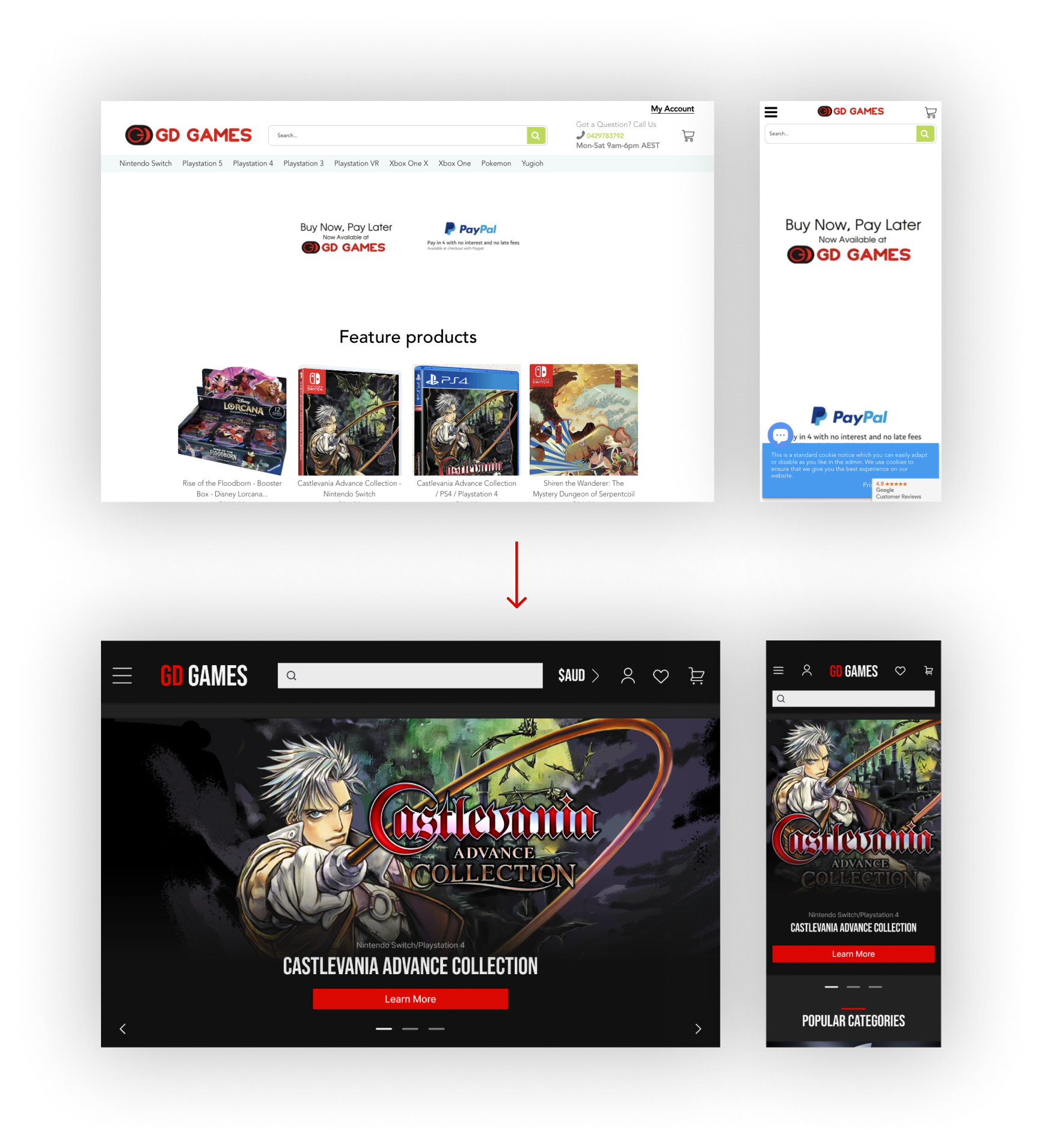
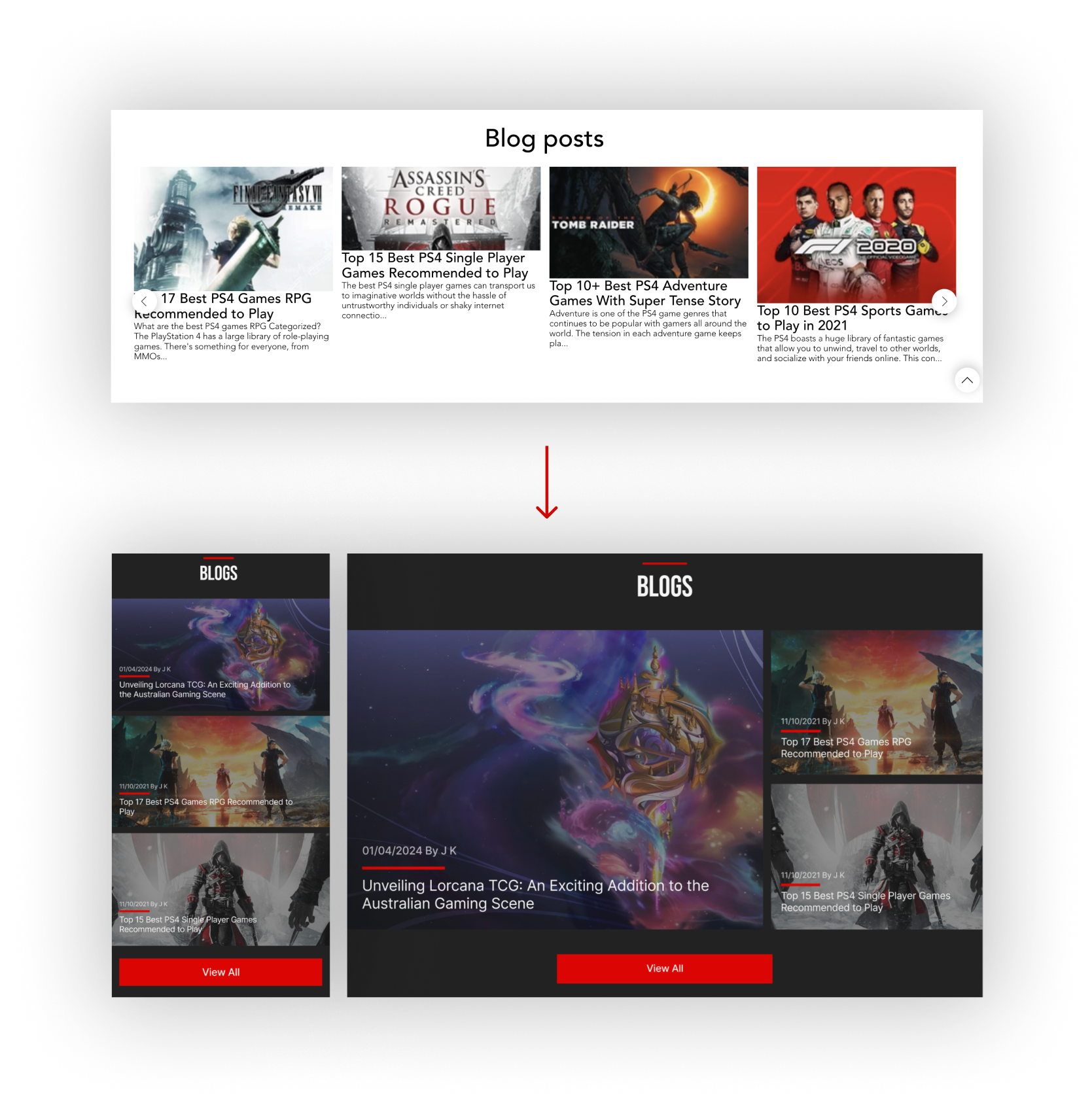
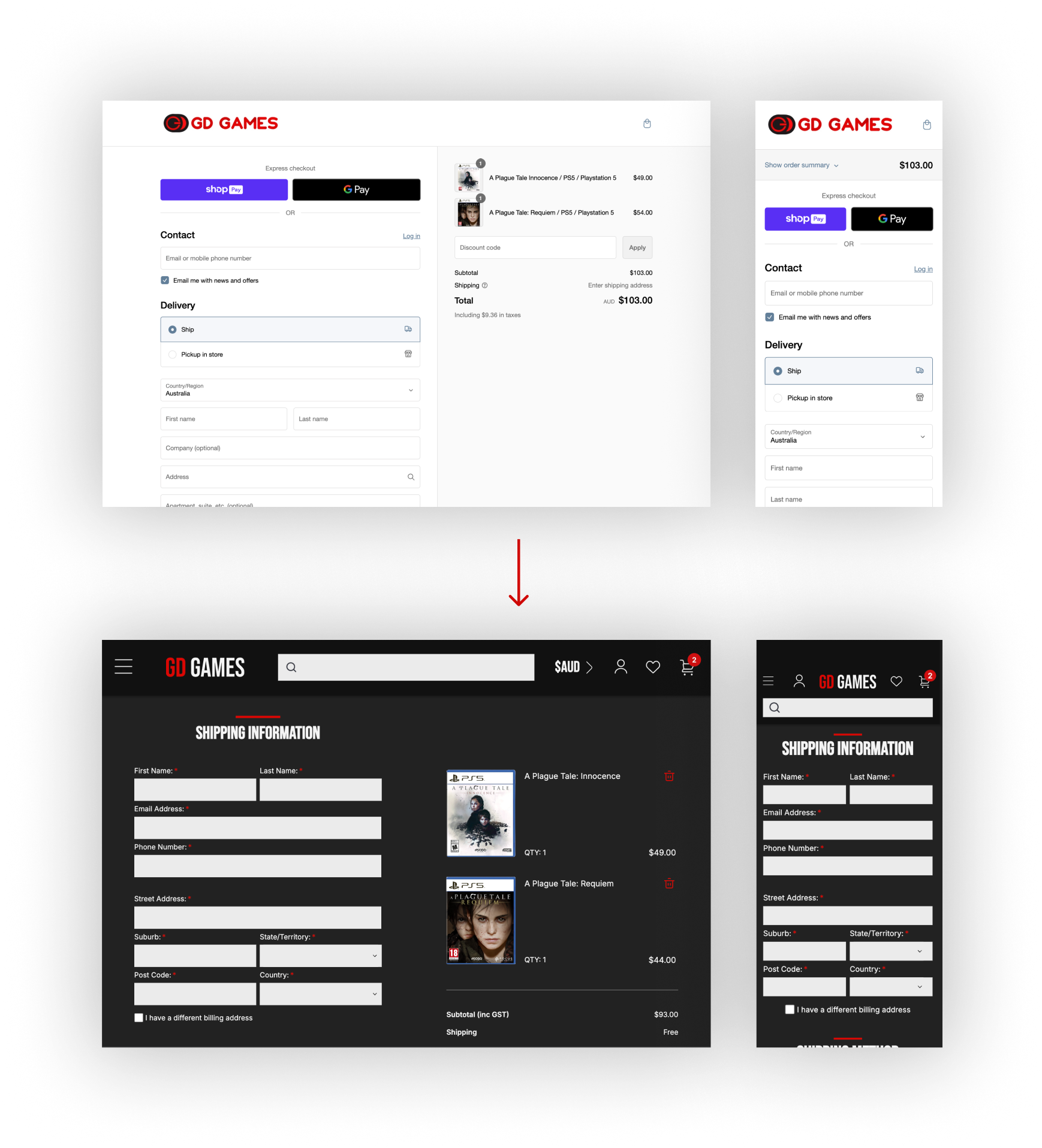
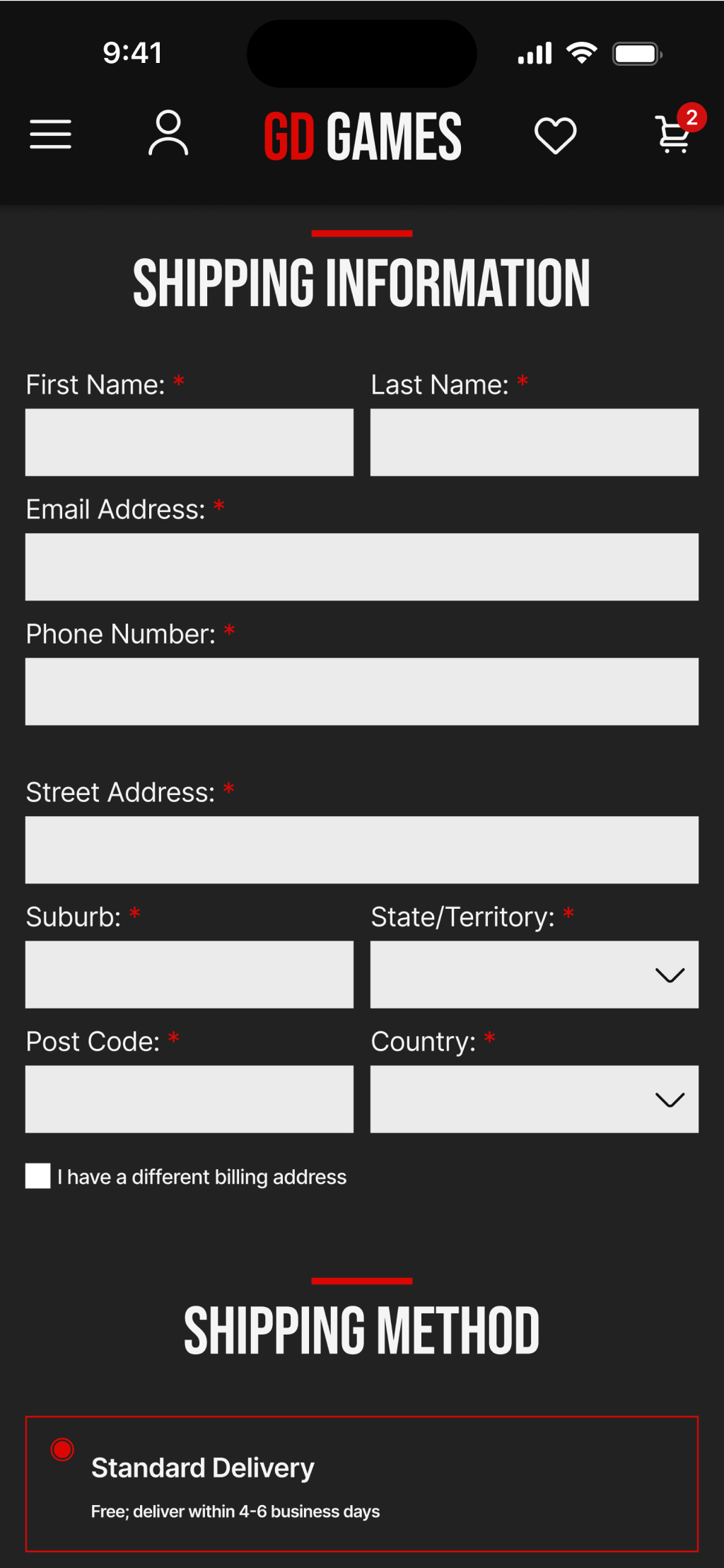
Some of the main issues with the original designs were readability problems, inconsistencies such as spacing and images, and color scheme choice. We’ve resolved them by paying close attention to alignment, structure, and spacing, ensuring all the elements are well spaced out or grouped together to maximize user experience.
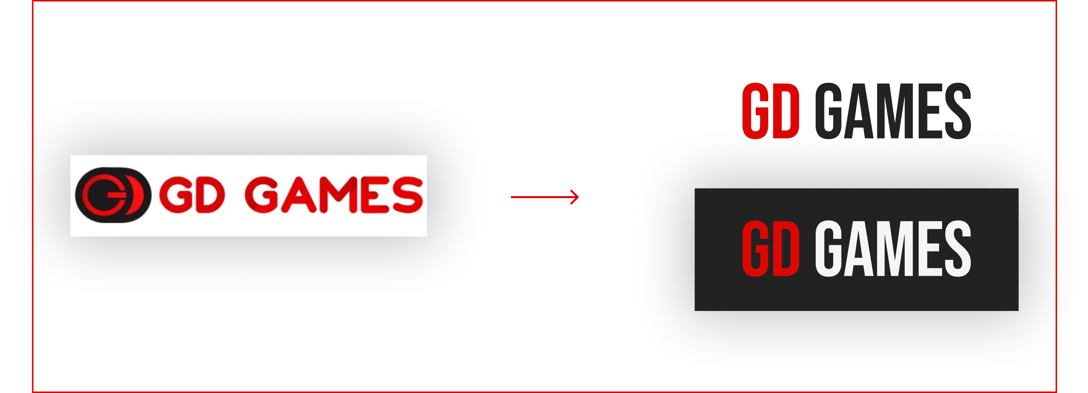
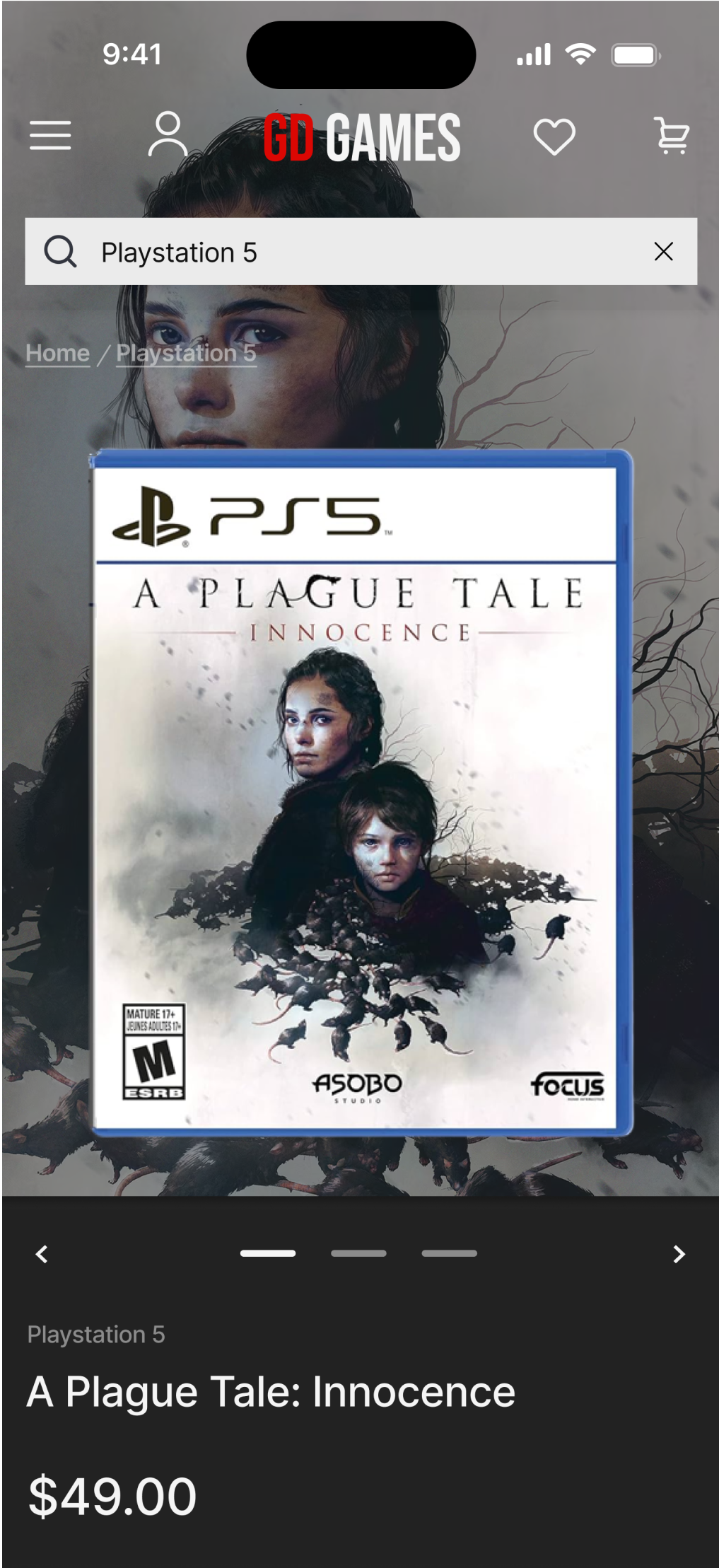
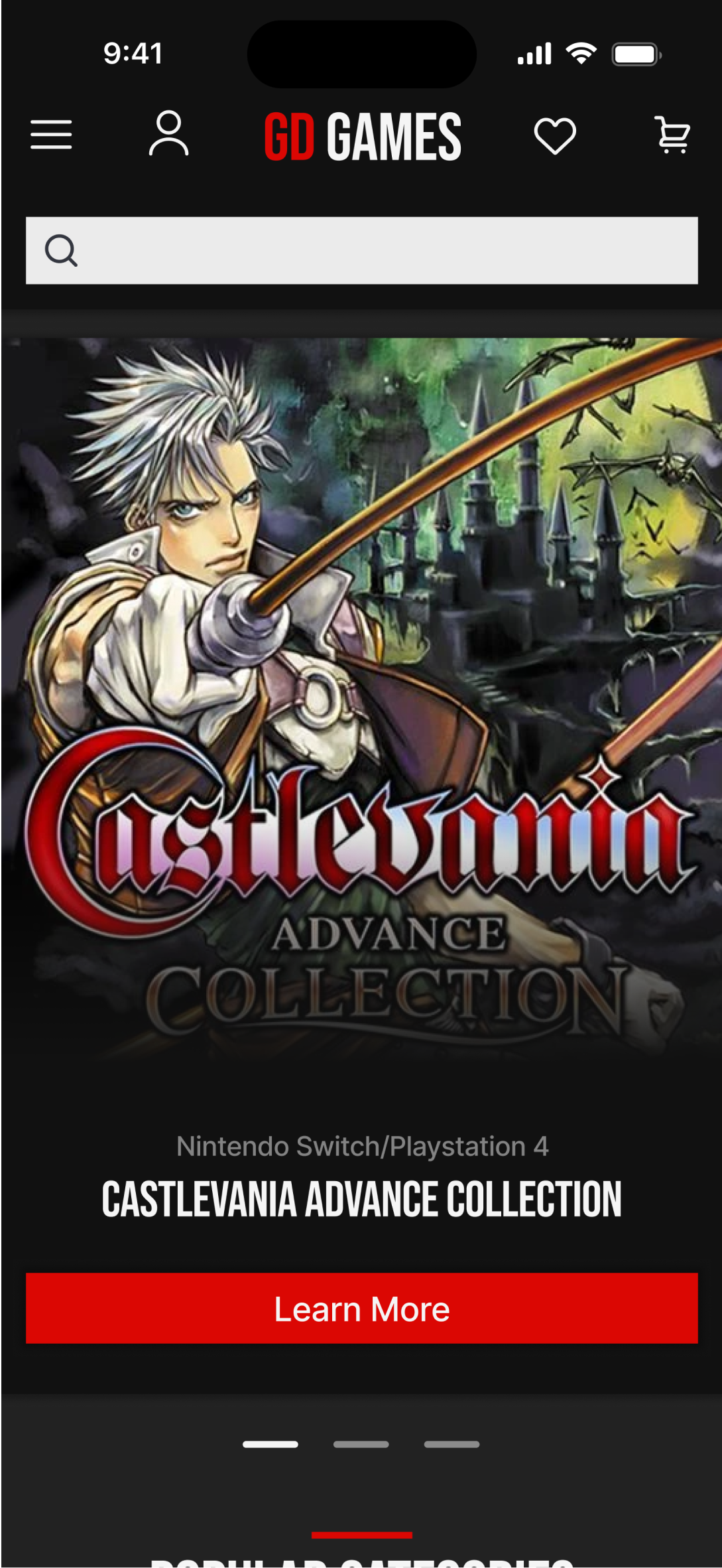
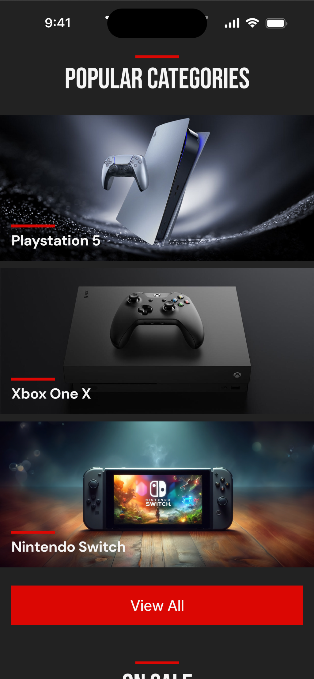
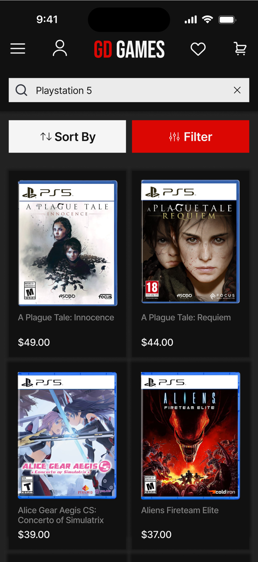
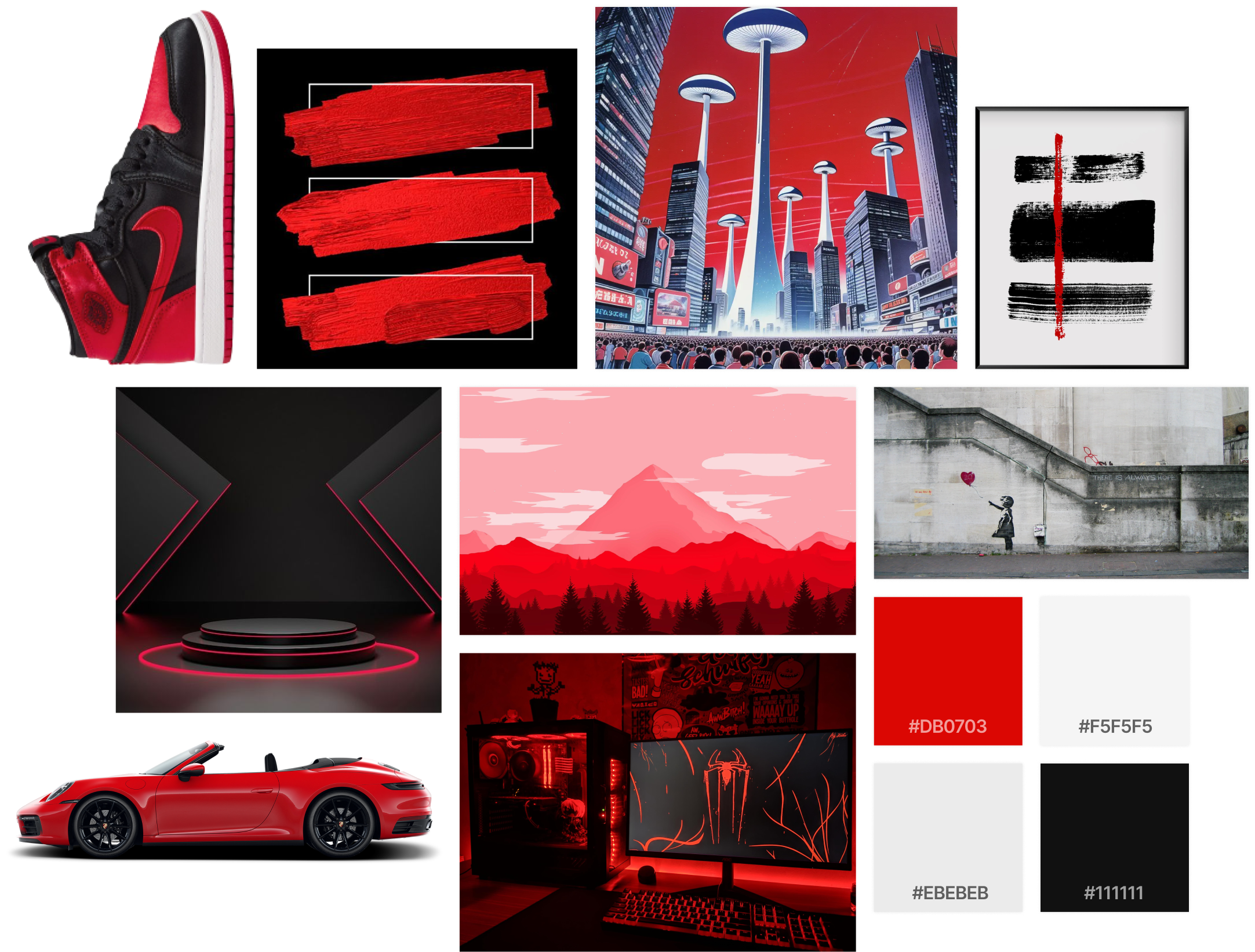
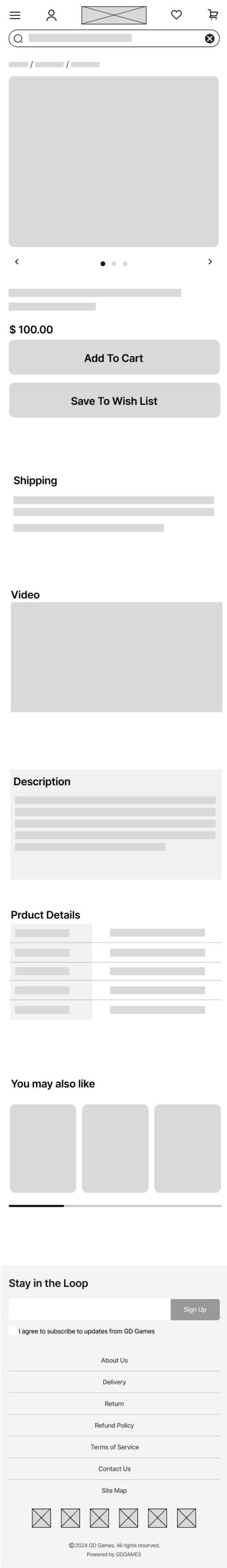
Brand-new Look
Based off the original design, we can assume that GD Games was trying going for a minimalistic/contemporary design. However, the alignments, spacing, inconsistencies, and colors just don’t accommodate that vision well. Therefore, we’ve re-colored the site to dark grey and paired it with white text and red as a supplementary pop of bright color. This red and black color scheme really gives the website a much needed “gaming” feel to it. The overall style is still preserves a contemporary and modern feel, but with less distractions. The logo was also redesigned to match the new style while still being differentiable from the predecessor. We’ve kept most of the content from the original but deleted some that we thought was redundant or not useful and added sections that we thought would be beneficial.
User-Centered Design
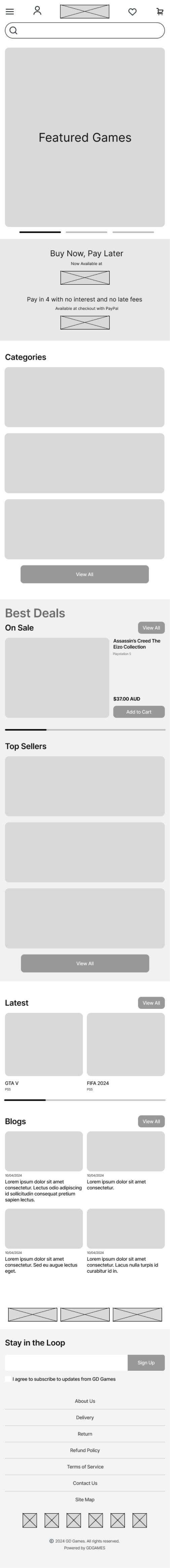
Speaking of adding new sections to the website, we’ve added/modified three new sections into the home page: ‘On Sale’, ‘Best Sellers’, and ‘Latest’. We eventually landed on these sections after thinking from the user’s perspective: what would someone who is trying to shop for video games online want to see? We believe these new sections can best guide users through the website and find what they are looking for, creating a smooth and effortless browsing process.
Design Process
1.
Identifying what parts of the original design need to be improved.
2.
Gathering inspirations and creating inspiration boards, referencing good design features from other similar websites.
3.
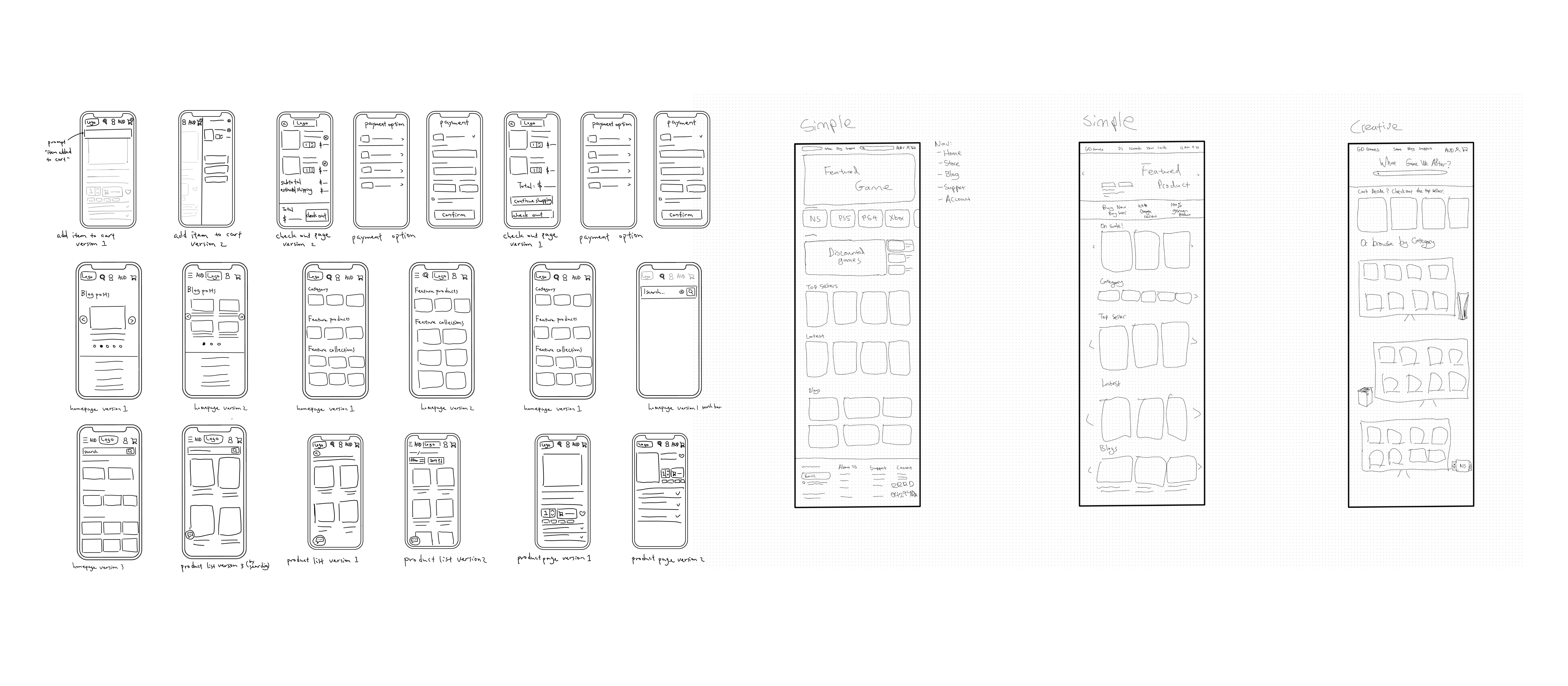
Sketching various new possible designs of the pages, comparing among them, choosing the favorite design out of them.
4.
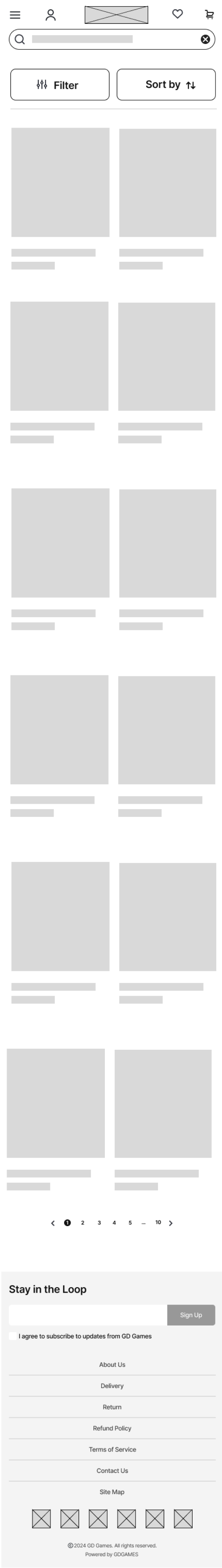
Implementing sketches into wireframes to test ideas, identify any gaps or unforeseen problems that weren’t identified in the sketching stage, then improving on the completeness of the design.
5.
Creating mood boards, deciding the theme / palette of the website.
6.
Implementing wireframes into high fidelity prototype.
7.
Conducting A/B testing.
8.
Finalizing prototype for mobile and desktop.
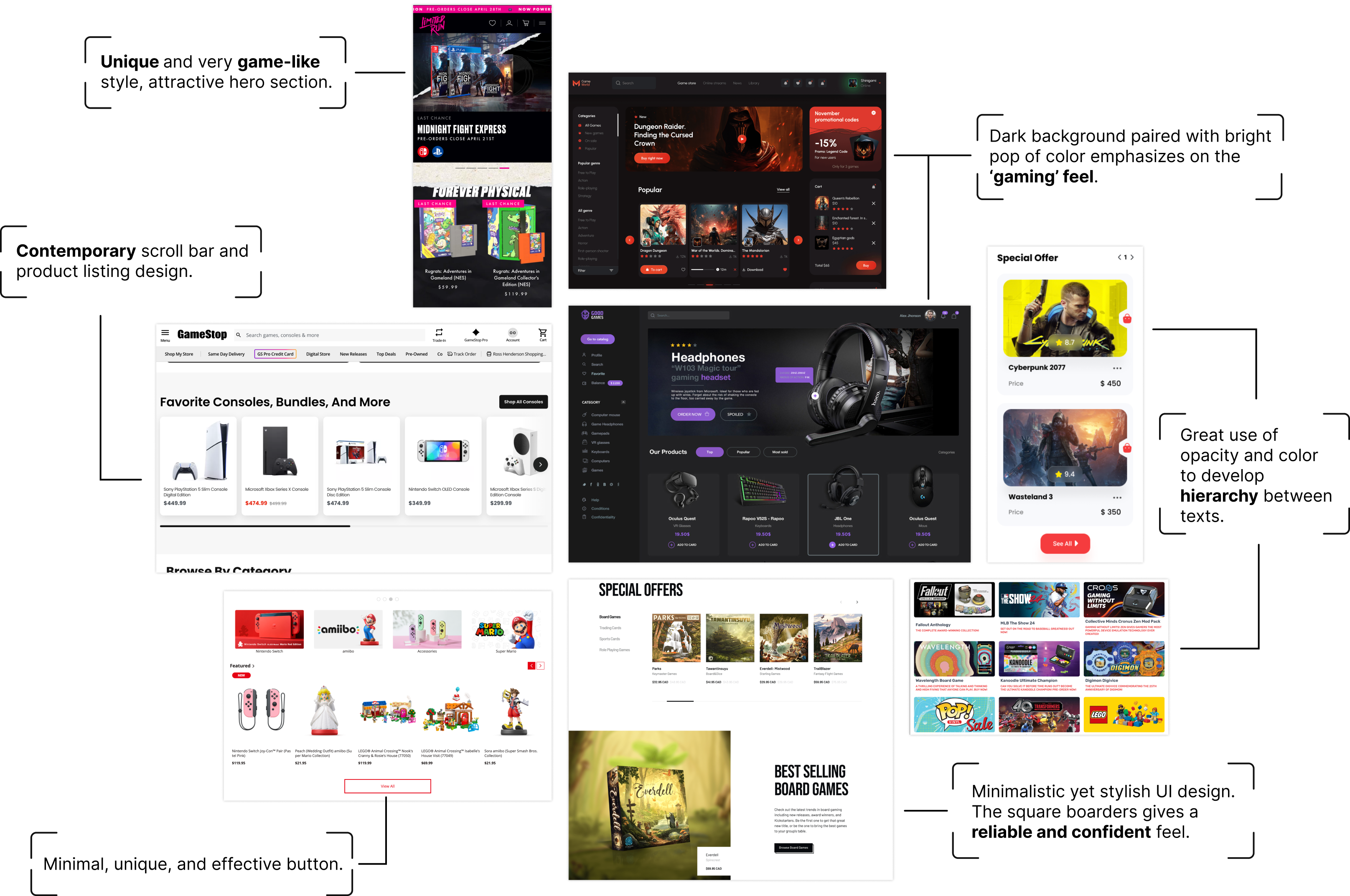
Mood Board
Inspiration Board
.png)
.png)
.png)